NYC & SF, 2013 — After a short period of experimentation and ramping up of our engineering capacity, we set out to build a brand new product to eventually replace the 13-year-old Safari Books Online subscription service. A small team of developers, product, and project managers, along with outside design consultants, treated Safari Flow as a startup within the larger company, in order to test the viability of our idea.
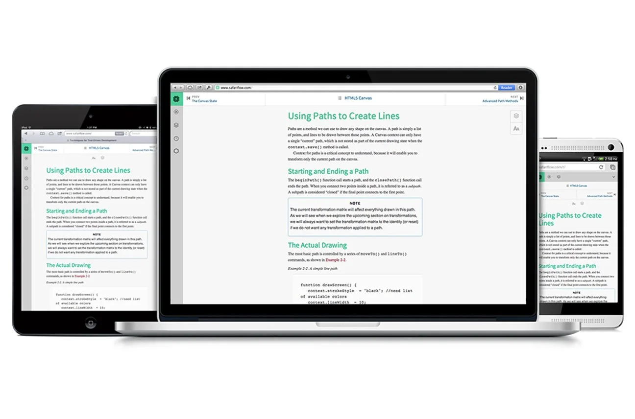
We focused on a small segment of the market (web professionals), and we refined the Safari Flow service over the course of about 18 months in order to build it up into a viable alternative to our older service.

Centered around a beautiful, clean and simple reading interface, Safari Flow gave its users a never-ending stream of recommended books and videos, based on a user’s stated topics of interest, as well as their reading and watching habits.

The dashboard is composed of cards, each representing a small chunk of content — either chapters of a book or clips from a video — that was presented to the user as part of a 'stream' of books and videos to consume.

We focused on providing the user with a clean, beautiful, and distraction-free reading interface. We also designed Safari Flow with mobile usage at top of mind, and generally worked from small viewports out. This allowed us to focus on the things that really needed to be there, and gave us permission to be very stingy when considering additional UI elements or features.

Previous
Previous

Safari Rebrand and Pattern Library

Next
Next

Creative Edge Classroom